NodeSpell UI
At the top of the main UI is the main menu bar, this is where you can find most of the top level functionalities of NodeSpell, such as saving and opening projects, setting view options, deploying projects, and account management.
At the bottom of the main UI is the status bar, it shows the current status of the project and events.
Most of the UI is taken up by the space between, the panels.
Panels
The first time you launch NodeSpell, the panels might be empty. You can open panels by clicking on the + button on the top left corner of a container, from the list you can create a new panel of certain type.
Inside each container, you can split horizontally or vertically to create more panels, or delete the container by pressing these icons on the top right corner of the container. You can also maximise the container by pressing the maximise icon on the top left corner of the container, clicking on the maximise icon again restores the container to the original state.
Once you have a panel open, you'll see them under tabs.
You can delete a panel by right clicking on it and choose "Close", double clicking on the panel tab prompts you to rename the panel.
Here are a list of most commonly used panels:
Node Graph
Node graph is the most important panel in NodeSpell, it's where you create and edit your node graph. You can create nodes, connect them, and edit their parameters on the node graph.
The top bar of the node graph contains a small menu listing all available nodes and snippets, you can also find a few buttons for common actions, such as creating a sticky note, image, tray and level node.
At the top bar you can also find the path of the current level, you can click on it to navigate to parent levels.
Parameter Editor
Nodes can have any number of parameters, you can edit the parameters of selected nodes in the parameter editor panel.
The top of the parameter editor panel is the toolbar, you can set the name and colour of the node. On the right you'll see a pin button, this will pin the parameter editor to the node being selected, so that you can edit the parameters of the node while you are editing the node graph.
The cog button will show you an extensive list of actions you can perform on the selected nodes.
At the bottom of the parameter editor is the comment section, you can add comments to the selected nodes here. These comments can be shown on the node graph if you enable the option on the node graph as well as on the nodes. They are both on by default.
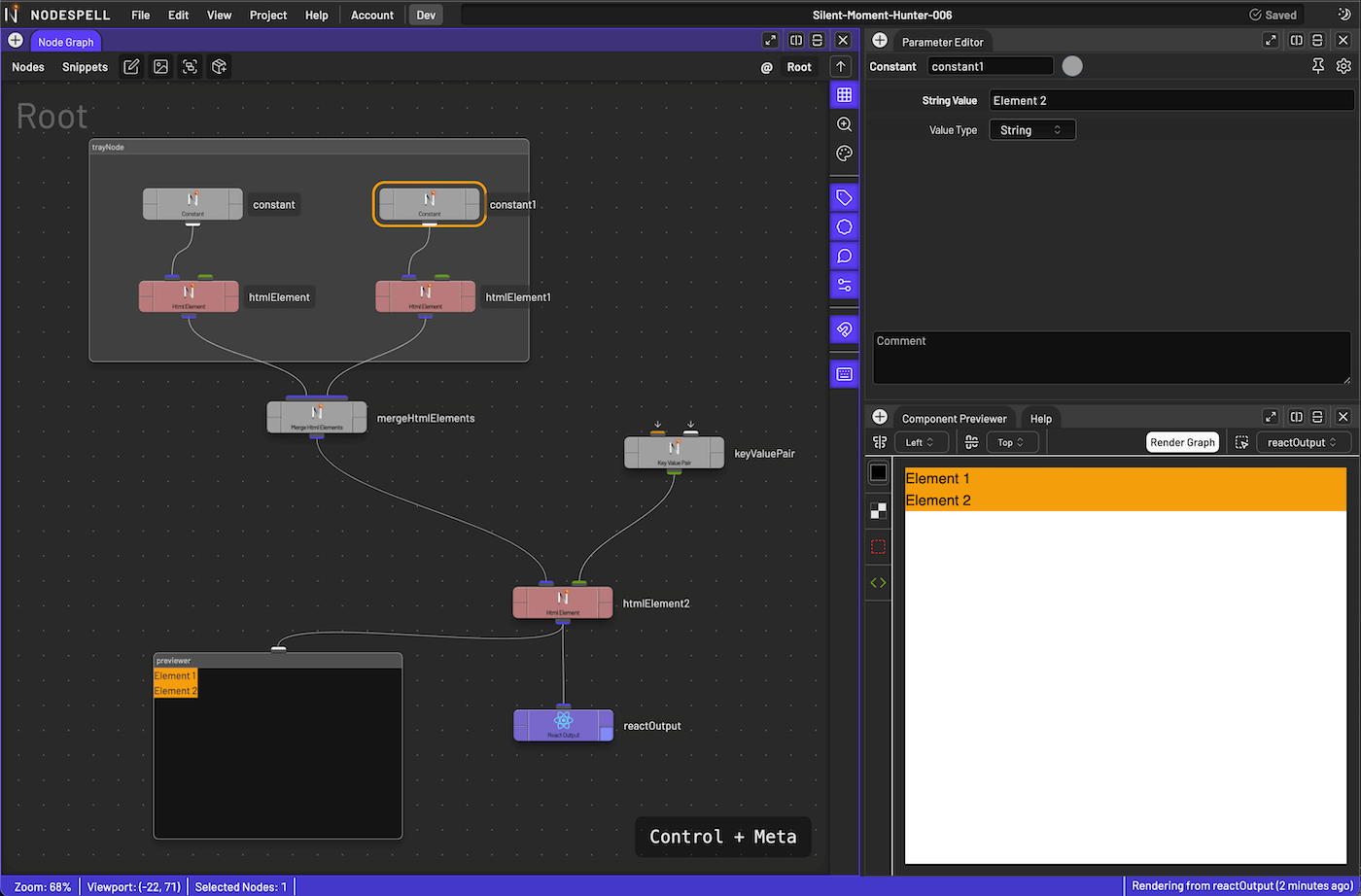
Component Previewer
The component previewer is where you can visualise the final rendered result of the node graph. It's useful for previewing the final result of the node graph, as well as debugging the node graph.
In order to use the component previewer, you need to have a reactOutput node in the node graph, and its preview flag is set to true.
On the top of the component previewer is the toolbar, you can set the alignment of the elements, trigger a refresh, and select reactOutput node to preview from the list of all reactOutput nodes in the node graph.
On the left side of the component previewer are a few view options, changing background colour, showing grid, debug borders, and the source code that's being rendered.
Console
This is where you can see the output of the node graph, as well as any errors that might have occurred.
Most events are logged here, such as when a node is created, when a node is deleted, renamed, copied and pasted.
On top of the console panel you can find a search bar, you can filter the logs by searching for keywords.
There is also a button to toggle whether or not long messages are folded by default.
Others
There will be more panels added in the future, such as the asset manager, the node library, and more.
We will update this document as we add more panels.